

Faster paths to AI powered products, or a customisation conundrum?
The short story version…
6 Open Source UI libraries reviewed, including, Geist, Material UI and Shadcn. News flash, no real winners or losers.
Skipping the Figma setup — Vercel V0 and other tools are allowing designers to skip the setup and jump right into styled components.
What are other AI ‘Vibe-coding’ tools using? Looking at Bolt, Lovable, Figma Make and even Claude.
Pros and Cons for Open Source UI libraries, pace vs. customisation
A Future sea of same? Is it worth the effort to customise these kits to reflect unique brand identities without falling into sameness?
My AI and UI learning adventure continues…
…with my documentation of new tools and methods digital designers are adopting in an AI infused era of workflows.
Tools like V0, Lovable, Builder.io and Cursor (amongst others) aren’t just making design faster, they’re changing how we start. Designers are now able to skip some of the Figma setup and jump straight to working prototypes, already styled and semi-smart.
Can we find the right balance though creative control/consistency and the quest for pacy production in our user experiences?
One area I’ve become a little nerdy about is how these tools are working with Open Source UI libraries.
These feel like a quiet revolution for designers, offering faster paths to products, removing some of the usual grind of setting up design systems.
A big benefit being that you don’t have to start in Figma with token setup, or fiddling with variables. Simply pick a tool/UI kit, and go. Fast, consistent, and real enough to prototype or even ship... in theory.
The current challenges of AI design to dev tools…
There’s a whole article in the challenges and how to get the best from these tools, but some high-level pain points include ensuring consistency in output, avoiding prompt overwriting what you’ve just done, not to overloading or confusing the tool… or get confused yourself.
We’ve spent the last few years refining our approaches to design setup and design systems, though with the rapid rise of the AI tools we now have, it feels this has become less in focus and it’s now about rapid prototypes and products.
Until Figma Make can fully connect to designed components, or tools like Builder.io, V0 can fully connect, or ‘establish design libraries’, then it feels we’re abandoning our rigorous setup…
Open Source UI libraries
A solid starting point… I’ve been skeptical of past Figma UI libraries, good at first glance, fiddly and time consuming once you try to customise, with the thought of “Why didn’t I just build this from scratch?” running through my head.
I suspect the same may be for these open source libraries. It looks a little daunting and it feels like to do it right, I’d need some developer help. For prototypes, proofs of concept, or quick tests, they’re a great starting point especially when it comes to ‘Codesigning’.
Which Open Source libraries are out there?
Here’s my quick summary of 6 open source libraries out in the wild. It’s a simple review of the initial starting point, backwards support for Figma and high level benefits.
Geist UI: Minimalist, developer-friendly
Born from Vercel’s internal system, Geist UI now stands alone as a lean, modern, easy-to-use component set. Perfect for clean prototypes and fast iteration. Tailwind-compatible, but a little limited in terms of full component variety.
💡 Figma support: So far I’ve been using directly in V0, though there is a full Figma library too for designers to play with. The actual link up to v0 is still a little fiddly in my mind, and not as straight forward, feeling more copy/paste link, see how it interprets — It’s better so far to just codesign in v0… If you are tempted to try working with Figma and custom design systems in v0, read more here.
Material UI: Mature, battle-tested
The granddaddy of React UI libraries. Backed by a strong community of 2,500+ contributors (good for maintenance and updating), balancing Google’s Material Design aesthetic with solid customisation.
💡Figma support: Strong, with community and paid versions. Full access (for customisation) requires the premium file. The Material UI Sync plugin is impressive — mirrors tokens, previews in Figma, tight dev handoff.
🔗 https://mui.com/material-ui/
Shadcn/UI: Fully customisable, the raw ingredients
This one’s a shift in philosophy. Less “here’s your finished kit,” more “here’s your parts, go build.” Shadcn gives you editable component code built on Radix UI + Tailwind. Perfect for dev-savvy designers or AI-generated code you actually want to understand.
💡Figma support: Limited, but it’s code-first by nature. Think blueprint over template.
Chakra UI: Modular, accessible, fast
Great for accessibility (follows WAI-ARIA standards for all components), quick prototyping, and flexibility. Its composable components and strong theming support make it easy to build fast.
💡Figma support: Solid. Comes with an open-source kit and a clear design-token structure.
HeroUI: Clean, evolving, ambitious
Formerly NextUI, this one’s gaining ground quickly. Sleek defaults, active community, and a growing design system.
💡Figma support: Decent — strong kit and structure, though less mature than Material or Chakra.
Flowbite: Tailwind-Integrated, design-first
Tailored for Tailwind users, Flowbite’s kit is fast and functional. Feels more like a utility-first approach. Aesthetic polish is a bit hit-or-miss depending on your taste.
💡Figma support: Fairly strong — decent kit, though visuals feel less refined.
AI Codesigning appears to lean one way…
React + Tailwind… this seems to be common path. The major AI platforms like Bolt.new, Lovable, Claude, even ChatGPT, has this setup when it comes to asking it to ‘make things’. This isn’t just a coincidence, it’s what works. It strikes the right balance, structured enough for AI to reason about, flexible enough to render whatever weird little UI a user dreams up.
Bolt.new casts the widest net supporting; React, Vue, Svelte, Astro, Next , then pulls it all back into coherence with Tailwind. Lovable takes the opposite tack: fully opinionated with React + Vite and a Supabase backend.
Claude sticks with core Tailwind utilities and mixes in curated components like shadcn/ui. ChatGPT doesn’t ship code natively, but when it leans on tools that do, they follow the same pattern. React + Tailwind. Again.
Why tailwind wins
Component libraries like MUI or Chakra are prescriptive. They give you a box. Tailwind gives you atoms. That matters when AI is generating UI — because users don’t want “close enough.” They want exactly what they asked for. Tailwind makes that precision possible. No house style, no theming constraints, just raw, composable styling logic that’s easy for models to reason with.
This isn’t trend-chasing. It’s convergence. The ecosystem has collectively solved for the ideal AI-to-UI interface layer. And until something better emerges, React + Tailwind is it.
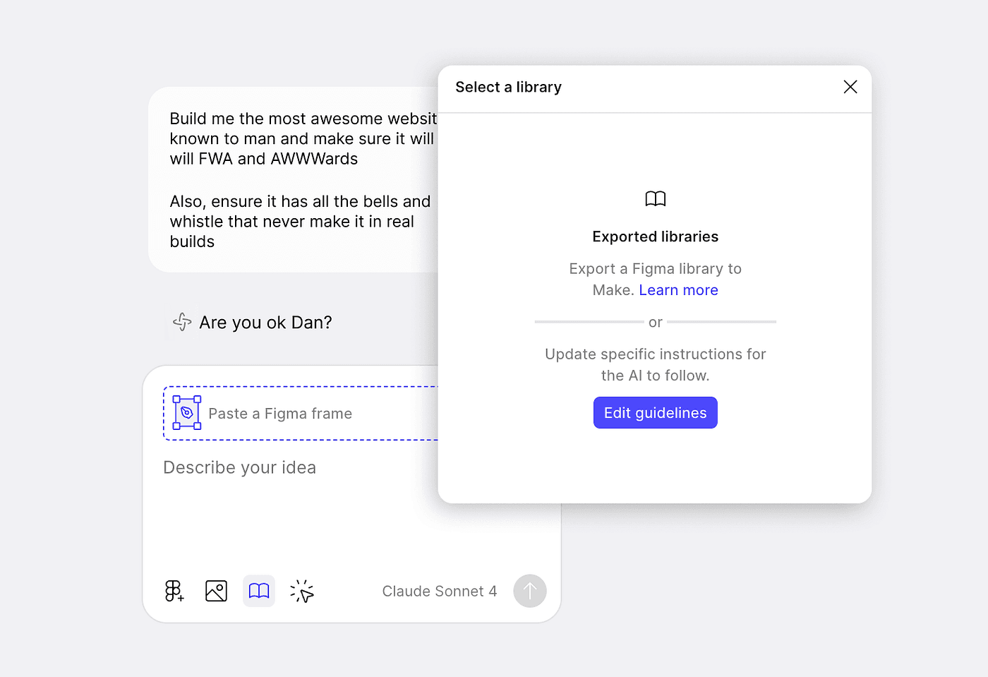
Figma Make…
Figma Make, doesn’t use a specific off-the-shelf UI library like Material-UI or Chakra, but instead generates custom React components. It doesn’t rely on a single off-the-shelf solution but rather integrates with popular modern frameworks and styling libraries, notably React and Tailwind CSS.
Update - After looking deeper into the code undergrowth to see what’s what, and how it ‘tidies’ on command, I’ve discovered it seems to be using Shadcn.

What I’ve seen so far is promising. Initial attempts to import files to Storybook resulted in a number of frustrating errors. I’m excited to see how the ‘connecting a library’ will work… like all other AI tools, it’s all in the prompt — keeping simple, it focused, using the correct development language, and being patient.
Press enter or click to view image in full size
Beware, the sea of same
Our speed and ability to design, build, and ship products with these Open Source libraries is great, though I do feel it results in what I see as fairly common/generic design styles popping up across the web.
It may not be a problem right now, but the sameness I see creeping in does make me pause and think ‘what is the best time to make use of them?’.
The question still remains as to what effort is required to make it feel ‘on brand’ or unique for me?
If you’re after easier full customisation then Geist or other Open Source UI libraries may not be your best starting point, but if you’re creating rapid prototyping and less concerned about getting things bang on from a brand perspective then it’s a great start.
If your priority is full styling control: Tailwind integration and Shadcn/UI or Flowbite
If you want a proven system with Figma firepower: Material UI
If you’re starting light and fast: Geist UI, especially if you’re in the V0 ecosystem
Pick a library with strong Figma support and customisation options
Coordinate with developers early
Final thoughts
For AI-assisted development, the best UI library really depends on what you value. There are limitations and benefits to all the libraries out there.
Using them as opposed to starting in Figma does require a mindset shift to how you begin, which can be unnerving, especially given the unpredictability of the AI tools at the present time.
My advice (for now), use with caution for real-world projects, embrace when you need to move fast, prototype and learn.
Geist UI: Minimal effort, clean start
Material UI: Battle-tested, plugin-rich
Chakra UI: Accessible and balanced
Shadcn/UI: Deeply custom, code-forward
The learning curve to using the tools is fairly low, as a designer though, it’s more about what comes next where the learning curve will increase. How do you meaningfully use these tools to produce real services customised to a brand level?
Next Steps
Explore and understand companies actually using these libraries at scale, to understand best fit for scale and project types
Based on project type, understand how these tools can be used with long-term use/maintenance and support in mind
Go deeper and document specific use cases where each library excels or fails, showing before/after examples of any customisation efforts