On Friday afternoon, Anthropic launched Claude Design - a tool to help you “create polished visual work like designs, prototypes, slides, one-pagers, and more”. It's the latest foray from a frontier AI company into the design space. For us, it feels more like the positive collapse of AI tooling as part of the PDLC, as opposed to a revolutionary change. As a team at Valliance, we’ve been geeking out using Cowork to create slides and prototypes for a while now - and bumping up against those limitations, so it’s exciting to finally see an AI company stepping into the design tool space in earnest.
We spent the weekend playing with it. Here's what we found…
Prompts, wobbly boxes, deleted assets & real-time collaboration
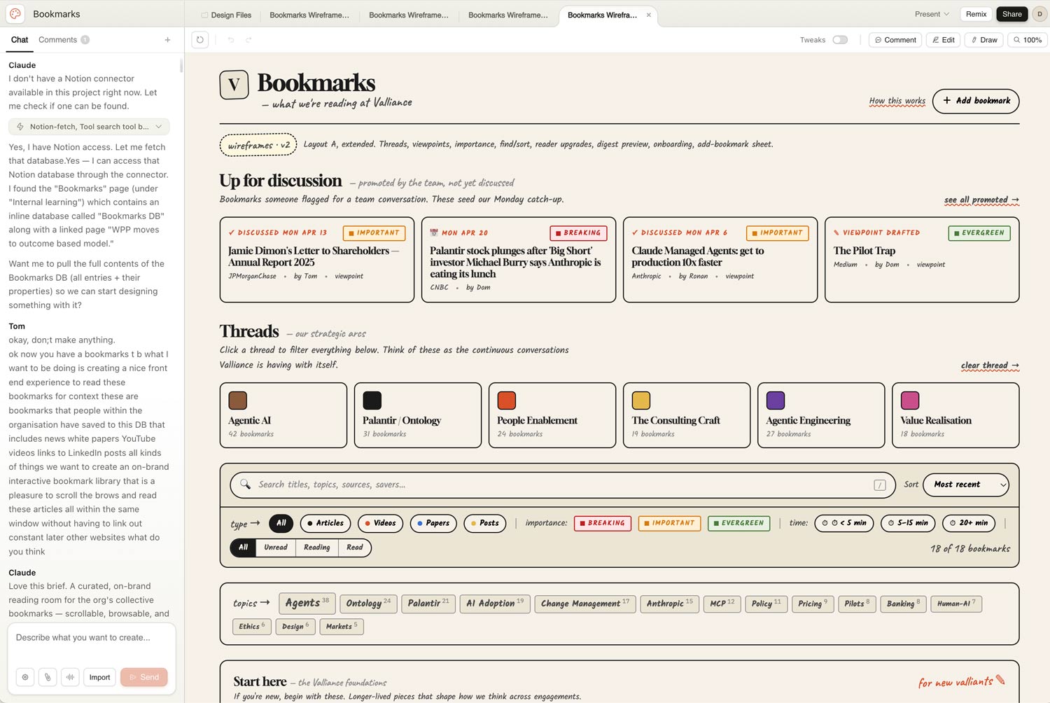
We decided to set ourselves a simple challenge. Use Claude Design to build a new front end for Valliance's internal learning resource library (currently a collection of scraped news stories, articles, and white papers living in Notion). Ninety minutes each, from a cold start. Go.
First impressions, for anyone who hasn't played with it yet. The canvas sits front and centre, giving much more focus to the design output. The pattern is familiar to your other AI tools (Lovable, Figma Make or Claude Cowork) but the slimmer left-hand side chat strip keeps your eyes focused on the design - which already feels like a nice change from Cowork.
You can still chat with Claude in the usual way of course, which is helpful for the more global tasks like “review as a UX designer, what do you think of this layout?”. Weirdly though, the UI of the chat feels like a downgrade from Cowork. It’s hard to know what you’ve said, what Claude has said, what your colleague requested, what’s just “thinking text”, what needs an action... It can quickly become a confusing wall of text. It often doesn’t tell you it’s ‘thinking’, leading you to feel unsure about what’s going on. Overall it feels in desperate need of some tried and tested chat paradigm patterns being used to clear up the clutter.
Point and click on elements to comment feels direct, a big plus from having to either screen grab what you want to change, or describe the thing to change, and then the change to make.
You can draw a box around a bit of screen to flag it which is nice and visual (”remove this spacing”, etc) - though a trackpad is clunky for this and maybe a shape tool would have been more intuitive? You can edit text, colours and padding directly which is neat too - it took a while to remember that this was a thing we could now do, when we’ve been so used to having to prompt and ask everything. We did notice with the slow “command > process > change” nature of working with an LLM, that if you quickly whizz around the page making comments, it can be hard to know what’s being actioned or not - a little shopping list of actions in the UI would be handy!
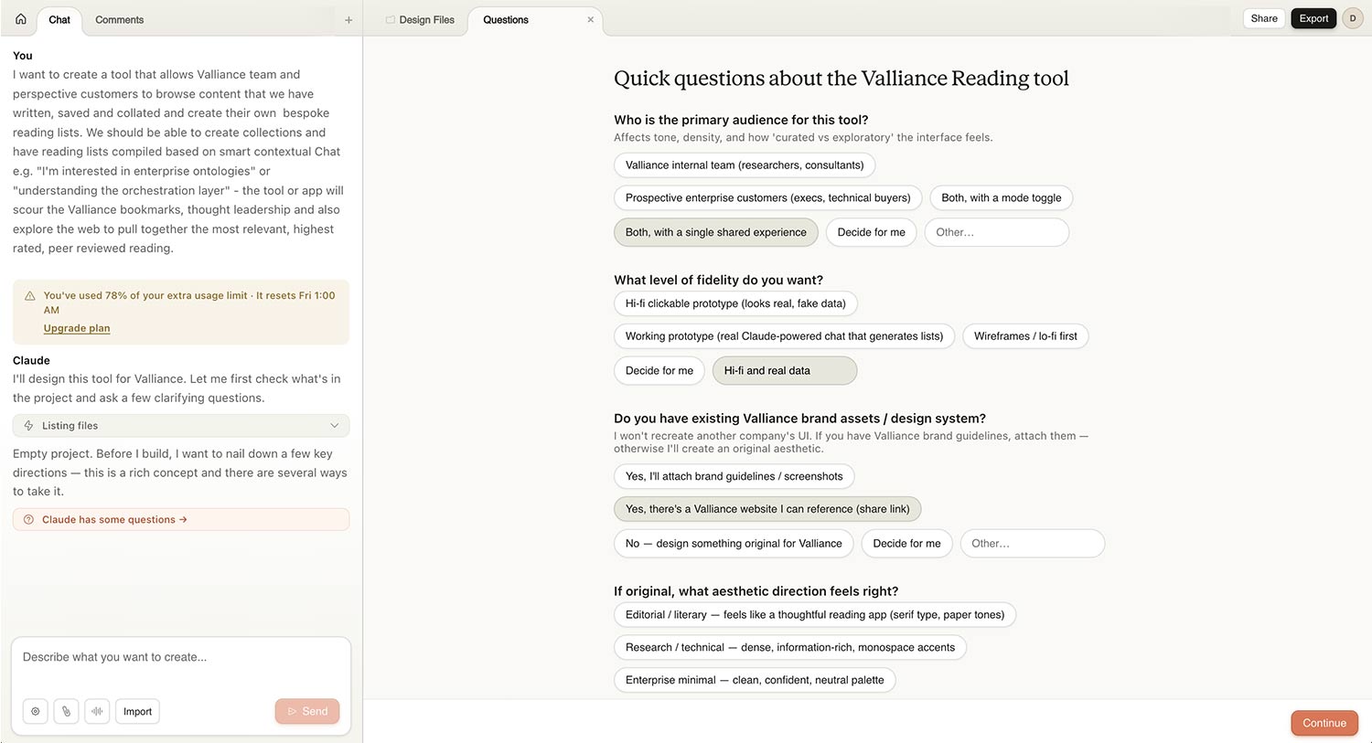
Getting started. Before it builds anything, it asks you a lot of questions. Considerably more than Cowork does. About eight or nine in our experience. They're tactical questions “do you prefer a grid or list layout?”. To be more beneficial in experience creation, they could be more strategic ”who's the user, what's the purpose of this page, what are the main jobs to be done?”. If they were to get the fundamental strategic framing right at the start, then the rest of the design process has a backbone to play off. Without it, you're immediately making decisions on aesthetics rather than user-centred reasoning. Similar to Cowork, to get the best out of it will probably mean holding it back constantly with “don’t make anything until you’re satisfied…” style prompting. It makes you realise the importance of bringing traditional workflow processes into AI context, along with the ability to move faster.
The wireframing feature is a nice return. Jiggly, Balsamiq-style lines that feel pleasingly old-school. It slows you down at the right moment and forces a conversation about layout and purpose before UI, which we liked.
Back to the task in hand - Tom went wireframes-first, then applied the Valliance website UI on top. The first pass was overcrowded and messy - typical generative AI creation of about 40% too much stuff. In the old world, during very initial stages, some core decisions can be assisted by showing very big simple boxes on the page with a label - “navigation”, “hero carousel”, “latest products”… etc. It would have been helpful to have a similar step here, to help really hone down the busy page content early on before getting to the content overload. By the third pass and honing down, it was actually useful, pulling Notion data in cleanly, showing flags and comments and time-to-read estimates. The end result was still complex, far from shippable, but full of ideas and inspiration to build from.
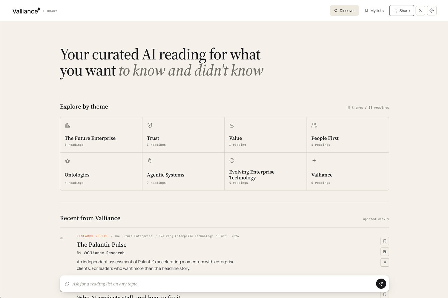
Meanwhile... Dan went chat-led. Searching by topic like 'ontologies' and letting Claude pull the relevant bookmarks back. The idea of custom collections wasn't in his original brief, but emerged halfway through the process and stuck.
We started where most people start. Alone, in our own silos, playing and exploring. But we quickly found the most interesting part were the moments where we shared out work and discussed it. Directly editing, adjusting, feeding ideas back and forth while on a call, like sketching and iterating rapidly on paper, but on screen.
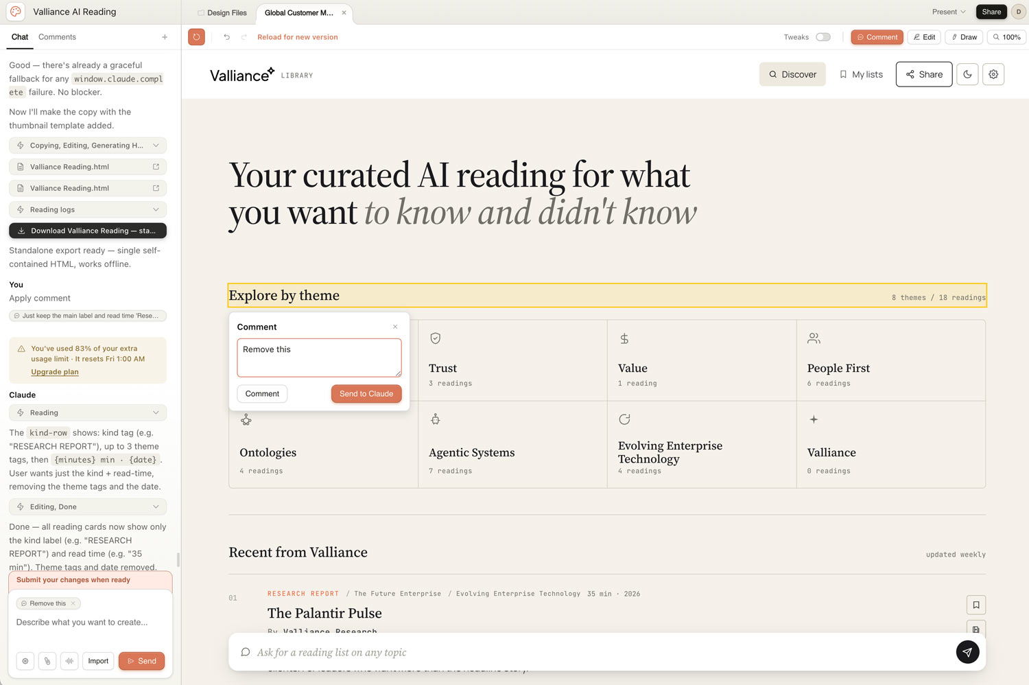
We even took one of our HTML outputs and dropped it in as reference into the other's conversation - which pulled the good thinking together fast. It was exciting, live, evolving, tactile. And we got to that point very quickly, within thirty minutes we had fully working screens to be discussing and riffing on.
Two designers, two starting points, converging fast.
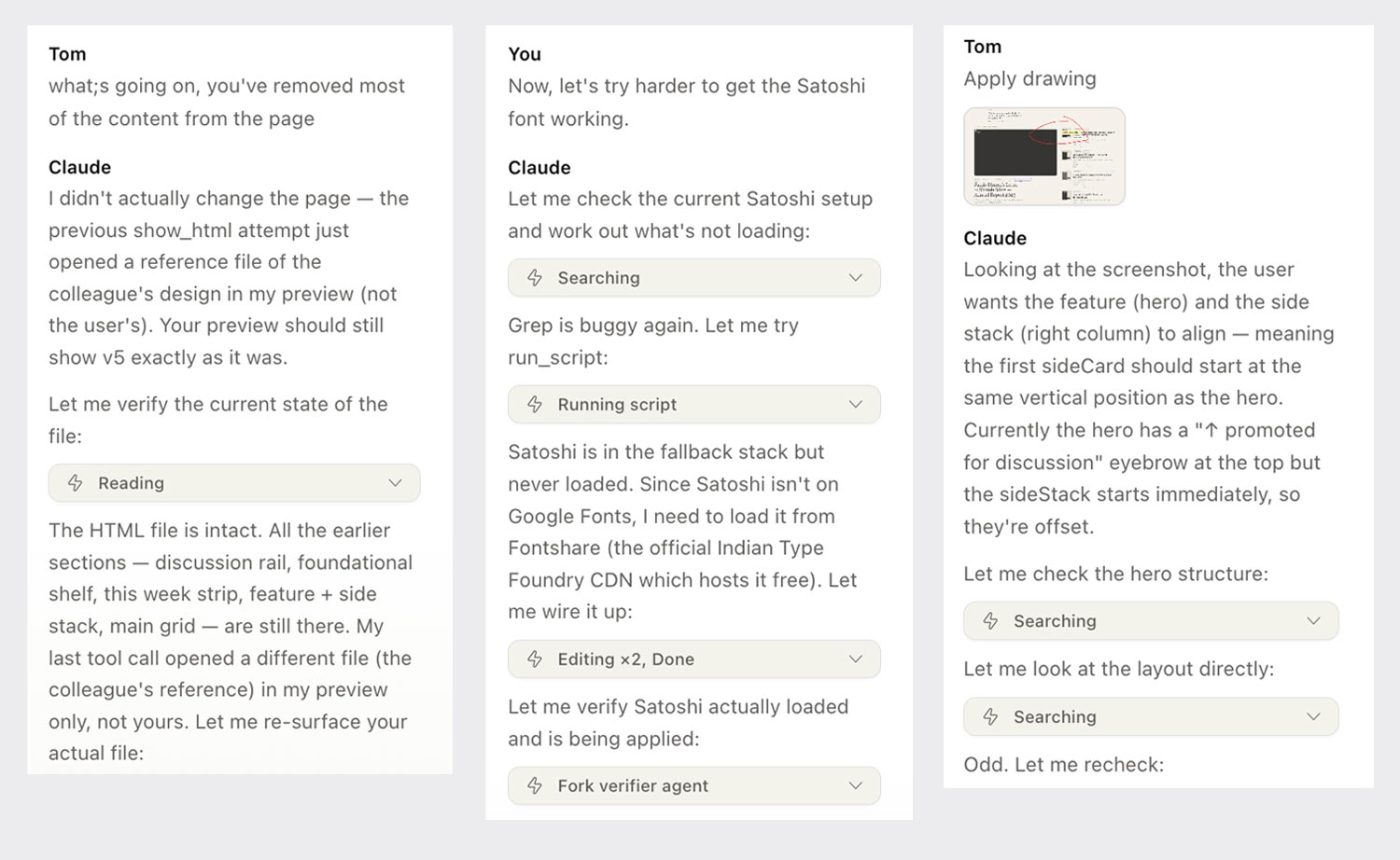
Both of us had trouble on the way - which is to be expected with a brand new tool. Dan's Claude deleted everything during a tidy-up pass and needed very specific prompting to recover. Tom watched it churn for fifteen minutes on one prompt, leading to gentle nudges of '…are you still doing anything?', then 'hello', then 'have you died?'. We both encountered 'chat upstream errors’ - Turns out this is a Claude error.
None of that was fatal and taken in the spirit of a first release. In under two hours we each had something impressive. Not finished, but enough of a proof of concept to start a real conversation about whether this belongs as a product for our clients. It sparked ideas, challenged layout patterns, and made us think together.
You can see it here 👉 https://share.valliance.ai/p/RKKNTUMS/ Full designers caveat - It has very limited functionality, is quite a large standalone HTML file and isn’t mobile friendly (yet) Consider this a ‘primitive’ to use a Claude CoWork term.
Bigger thoughts
At the moment Claude Design is browser-only and feels quite standalone within the Claude suite. No access to our Cowork skills and plugins, which felt strange after three months of leaning on them. Each session felt like a fresh start. The shared memory and context improvements Anthropic is working on will help, but the deeper question of how outputs from one Claude tool flow back as inputs into another remain. An HTML built in Design should feed the next Cowork conversation or a Code handoff without losing the reasoning that produced it. Right now that chain is still disconnected. Solving it is probably more important than any single feature on the current roadmap. It’s a tease of a world where as a team we’re working on strategy, forming a backlog, moving into design, and then into deployment code, all together.
The ‘handover to Claude code’ looks to be a key feature which is downplayed as part of the sharing feature. Going forward this blend of design-development pipeline is going to be crucial to pull the worlds closer and ensure that we can created products seamlessly as a team.
One of the bigger design challenges we foresee, and need to mitigate against, is the risk of visual sameness. There is of course something to be said for patterns and familiarity, but let’s not blindly accept what Claude gives back. To overcome this, we need to ensure there’s solid design system foundations in places, but we also need to keep those experienced human UX/UI design eyes all over the outputs. This will go some way to ensuring what we create stays true to how you want your brand and product experiences to be. We can speed things up, then add real value with the human critical thinking as part of the process.
One really positive feature we enjoyed was team collaboration, new to Claude (not so for users of Miro, Figma, PPT...) Claude Design attempts multi-person collab on the same project, which as far as we can tell isn't happening elsewhere in the Claude suite. It's early and the patterns don't quite work yet. Closer to SharePoint or PowerPoint live-editing than Figma's cursor-based dance. When two of us worked on the same piece, we kept having 'did you do that, or did Claude?' moments. It's unusual and strange and exciting all at once. And it's a step change that will inevitably carry over into Cowork and Code in the future. You can almost see the walls between the tools breaking down, and the sense that design, code, and strategy are really just lenses on the same content. This time next year, these probably aren't separate tools at all. They're modes you toggle in a single flow.
Looking ahead
The multi-person collaboration tease in Claude Design got us thinking beyond the human side of collaboration. What happens when the other 'people' in the chat aren't people?
Right now, Claude Design is you, your colleague(s), and one Claude mothership. You prompt, it builds, you critique, you iterate. The next step we'd like to see is other agents in the chat with you. Specifically crafted ones: a UX agent, a UI agent, an accessibility agent, a compliance agent - custom agents trained on your organisation, your design system, your customer research. Each one present throughout, contributing, arguing. The UI agent loves a layout. The UX agent pushes back. Accessibility catches the contrast ratio the UI agent missed. Compliance flags a GDPR risk… You curate and co-create with your colleagues and agents, the overall LLM becomes the operating system simply actioning the changes.
At that point you're not just using a tool. You've got something closer to a bespoke design team that can't be replicated, because it's unique to your enterprise. That's exciting!
Claude Design is inevitably a little wooly around the edges today, but will be better in six weeks and much better in six months. The teams who get the most out of it will be the ones who start thinking how they can rebuild their creative and engineering practice around the fact that the toolchain is starting to collapse, and follow that thread to where it actually goes, because that future is very interesting.
Final note
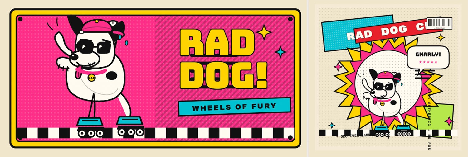
In the spirit of experimentation, it’s important to raise your failures and learnings. For us it’s important to realise that this is an generative HTML tool, not a generative imaging one. And if you ask it to create an image of a rollerblading dog in the style of a 90’s sticker you’ll get the weirdest most amazing image made from HTML elements you’ve ever seen - gnarly!